Brand & Identity
I approach branding as a system, not just a logo. My work spans identity development, brand evolution and stewardship, creating visual languages that feel distinctive, recognizable and consistent across every touchpoint. From typography and color to packaging, signage and physical spaces, I focus on building brands that honor where they came from while giving them room to evolve.

Evolving a Legacy Brand
With more than 50 years of recognition behind Anthony’s, the goal wasn’t to reinvent the brand, but to thoughtfully evolve it. I modernized the existing identity while preserving the visual elements guests already associated with Anthony’s, creating a more cohesive and flexible system for how the brand shows up today.
MY ROLE:
Brand Evolution · Logo Refinement · Visual Identity · Color Strategy · Typography
Color Evolution
I shifted the brand toward navy as the primary color, reflecting Anthony’s waterfront roots and Pacific Northwest heritage. Northwest blue brings a fresh, coastal feel, while the signature red remains as an accent to preserve brand recognition. Together, the palette feels more modern while staying rooted in Anthony’s history.
LOGO EVOLUTION
The updated mark retains the familiar salmon, diamond, waves and Anthony’s wordmark while introducing cleaner typography and a more contemporary visual balance.


Separating the identity into a flexible suite of marks allows the brand to adapt across different formats without losing recognition.
THE IDENTITY IN ACTION


Brand in Motion
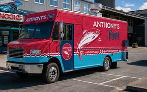
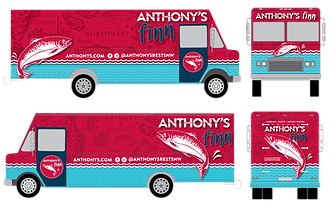
To bring the Anthony’s Finn food truck into the evolving brand system, I introduced the Northwest blues and seafood illustrations used throughout the new identity. Because the truck’s signature red had become highly recognizable, we chose to keep it as the primary color rather than make a dramatic shift to navy. The original scale pattern was replaced with hand-drawn seafood sketches, creating a more modern, playful look while connecting the truck to the broader Anthony’s brand.

Before
Design